well this is akward i had a blog account a while ago but this whole google+ has messed my previous one oh well jordster4000 wasnt a professional name anyway. ill be posting my animation work more likly to be be the test work and the concept that has gone behind it.
http://jordster4000.blogspot.com/
this has everything that was required to do the short lab dasterdly, which can be found on my youtube channel
(most of the stuff hear has been copied off my previous blog sorry about the link tabs, different Youtube account also has been the reason behind it... anyway sorry for the incovenices and if you have any comments or querys feel free to email and ask)
http://www.youtube.com/watch?v=FtN3XzxmtNI&feature=youtu.be
im working on a number of projects if your interested you can follow me on
https://twitter.com/#!/JordanPaul_
Layout design research
So what does a lab look like????
(what a lab appears like on a tv show)
(what a lab looks like in a cartoon, guys feel free to comment on their love for this show!!!))

(school lab....lets be honest it looks a bit dull)

(hospital lab....anyone else terrified lying in those chairs??)
So what did they all have in common???
What needs to be added to mine??
How awesome is this gonna be???
Well looking at these interior layouts i got a good idea what labs look like and a good idea on what ill be doing for my layout and i should be posting some images of the drafts online in a few days :)
wish me look and be sure to keep a look out for my progress :)
Day2-3
I have been looking at space, lighting colors and what labs look like in computer games cause I don't want to be too realistic with this layout.
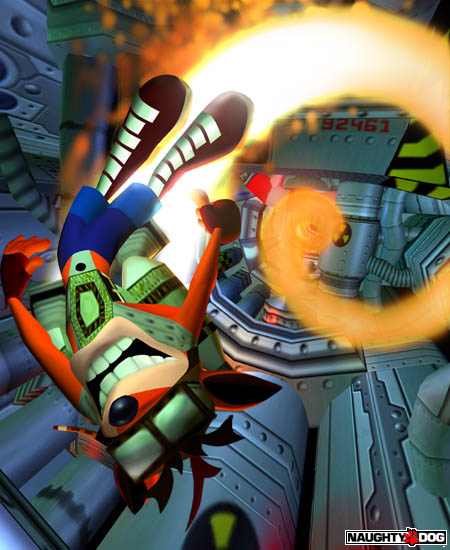
(The technology in this game looks awesome)
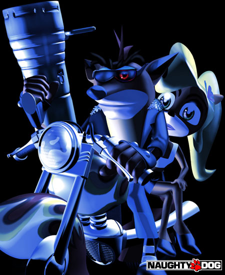
(I like the use of lighting in this piece)
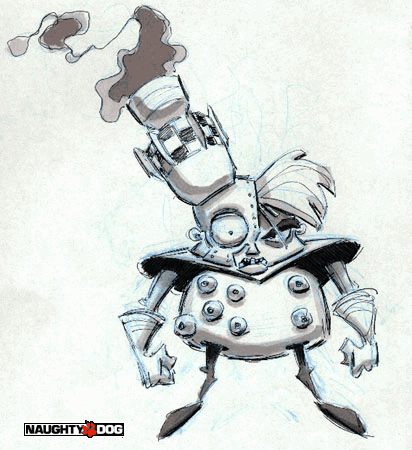
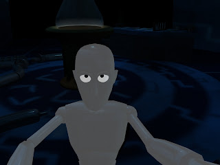
(Evil science man gotta take some thought in wat my character is gonna look like)
So with more research i have a greater idea on what i will be doing for my layout ill be sure to post something soon, but first i need my printer cables and what not so i scan it all in lol.
I have a great deal to think about but i reckon its all gonna come out pretty well and you gonna see how it looks in a couple of days.
day 4

gutted gutted gutted i thought i was being clever doing a lab since everyone all they seem to do for this exercise is offices and lounges i still keeping the lab theme but i am thinking of throwing in a gimmick in order to make it unique. Something will be different about this lab that makes it stand out from every other lab, maybe a mixture of a environmental twist such as tropical laboratory or a lab that is in a low powered area, ive got to give it a sense that there is a back story to it, still playing with ideas ill be sure to post on the developments when they happen.
On a brighter note home in leicester just for the printer cables i left when i moved back up to uni woops lol always forget something.....Ill most likely add some work on the Sunday this way ive the weekend to modify and tweak the designs, ill show the development as well when i post it.
Ill update again soon :)
day 5
inspired to make my lab look futuristic and amazing, but where did the inspiration come from???
ONE WORD!!!!! TRON!!!!!

The neon glowing lights would look amazing going up and down my lab giving it a sense of hi tech lab.
I said it once and ill say it again the work will be posted online very shortly just applying a few of the touches to my drafts with everything that i believe will work and we will see what the final outcome looks like.
Sketches and designs
looking down the list you can see a range of initial rough looking drafts, till eventually we reach the bottom image and hopefully with time and patient it will be constructed in 3d.
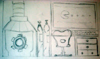
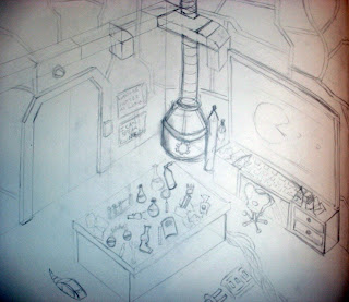
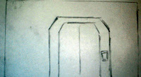 As
you can see i did rough designs of front and side views and of then
drew a range of props to add to the 3-dimensional design and add more
character to the final design. As you can see these are roughs and
hopefully the design will develop as its being built :).
As
you can see i did rough designs of front and side views and of then
drew a range of props to add to the 3-dimensional design and add more
character to the final design. As you can see these are roughs and
hopefully the design will develop as its being built :).Development!!!
So for my development i have decided to tweak a few items that i have been working such as the layout of a few items and the power generator. So like again you will see an updated version later during the week so keep watching.
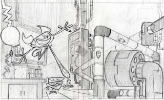
Redeveloped ideas
taking what i had learned previously on the first design i decided for the best interest of my design i should redesign it so that it had more of a unique feel and look towards it.
So
i been working on the layout in maya for a while now so we have a near
finished model made, i must say i have enjoyed making my scene. Its
nearly done and i not really had that many problems with it although i
never expected it to take as long as it has done. So ill chuck a few of
the images of the work i have done so far. But taking that in mind i
still have texturing and lighting to add to this work so your bound to
see a variety of images of my work as we go along.
So
using the scene i have made on paper i have been able to start building
in Maya making the props required for me to start building a final
outcome.
As we can see i have a few examples of the models i have built to have in the finished scene. To give the feel of a lot could happen in my scene its ideal to have a lot of props built.
Building a grand range of objects for the scene takes a huge amount of time.
But im hoping it all adds to the final scene which with any luck should look impressive.
So what you lot think its coming together a bit now :)
Uv mapping was required in order to make my model have the textures to make it look epic. i will say however uv mapping more complicated and time consuming then i could ever image :).
When all the texturing is done and over with i managed to get this so pleased it looks awesome.
(although i still have a few things left to texture)
Lighting!!!!
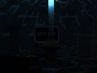
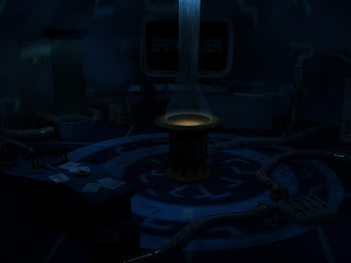
oh how do i love lighting it completely changes a scene look and compare the 2 images and notice how they both give off a different feel so i gonna have a play around to see the overall effect you can achieve.
Storyboards for the layout
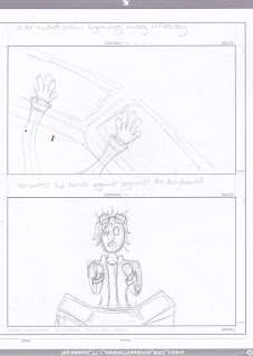
So here is the storyboards for my animation that i have been working on.
Well as you can see the storyboards show a clear sense of direction of what will be happening throughout the animation. As you can see i had a long thought on how it should come along and simply described what I intended to do in each scene. Although i am well aware storyboards are not always what the finished article will look like and i have used my storyboards as a guide when it comes to building and working upon my scenes.
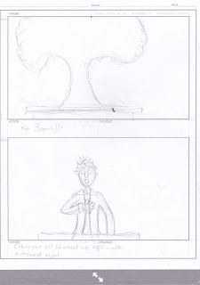
Well i had the storyboard reviewed and it was agreed that it was far too long for the project considering we don't have the longest amount of time to work upon a animated piece if i was to follow the storyboard. It work out the first piece was in the 50 seconds mark woops my bad like usual i got carried away and went over the top.
So taking this on board i have modified and changed the story and some of the scenes so that it works better overall, but this is still part of the drafting stage. So if you can continue towards the bottom of the page you can see the first animatic.
http://www.youtube.com/watch?v=Bn7qFSJFSJE&feature=player_embedded
My first animatic after having done this i have decided to work upon my storyboards some more so i got a clearer direction what is going on in my scenes. This time i will have a clearer idea of the time each scene will be. So ill post my storyboards with descriptions and camera settings and scenes next to show some development in my work.
Camera will be focused at the completly away from the character we will be introduced to the layout first. Camera will be focused near the door to begin with then we will have it spiral towards the next view. This opening scene will be around 6-8 seconds long and its important to get them right due to the fact this opening scene will set the scene for what's to come.
The side view of the character typing viciously,
camera will slowly move in towards character but must always avoid showing the computer screen. 2-3 seconds long it will be.
This
is the table slam scene it important to nail this scene cause it really
will set the mood. a slight camera shake when the fist hits will be
require to give it that bit of energy that is needed. 1-2 seconds long
after all a fist slam isn't really gonna be long.
ill have this 2-d piece playing over the computer screen. simple camera hold it still not too long a scene 3-4 seconds long.
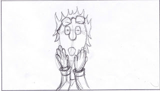 Final
scene although there are a few arguments weather are not the game
over scene should have this to catch the audience off guard.
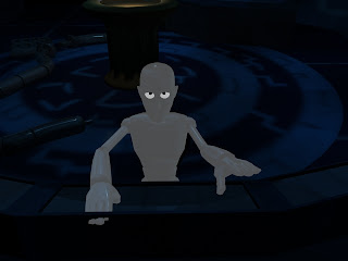
What is my story well as you can
see we have a scientist we are in the lab we are introduced to chemicals
gizmo's and a variety of gadgets. the camera moves along we see our
character typing away presumingly on his next big experiment. you see a
vicious slam...why, gameover, our character has been playing games its
meant to catch the audience off guard. we then have him in all of his
frustrations slam his head against the table.
So all and all its a bit of fun this story, this scenerio have some fun.
So all and all its a bit of fun this story, this scenerio have some fun.
Another new animatic has been added have a look at the progress when compared to the earlier one.
Storyboarding with renders sorted out the camera for my animation for new each image thats where the camera goes except the first 5 we have the camera mover gradually till we get that scene.
the rest are instant camera changes.
http://www.youtube.com/watch?v=ZzfHDI1oW8I&feature=player_embedded
my first test for animation however i still feel as thought there is something missing so ill be working on that shortly.
Sadly when rendered using a compression i lose a lot of the darkness and brightens the scene so i am hoping that is not held against me.
As you can see pac man is no longer part of the project he just didn't look right as he went across the scene.
so i scrapped the idea and shortened the scene.
but here is the final finished render
http://www.youtube.com/watch?v=M213kyZznDE&feature=player_embedded
here is also a alternative render with text popping off during impact but that got cut
http://www.youtube.com/watch?v=x3h4x0x0MYA&feature=player_embedded










No comments:
Post a Comment